
Editable PowerPoint maps: a complete guide
A map on a slide is either something you can change or something you can only replace. This guide explains the difference, compares the four usual ways of getting a map into PowerPoint, and says when each one is the right choice. Sometimes that is not GeoAddIn.
What "editable" actually means in PowerPoint
The word gets used for four different things. They behave very differently the moment someone asks for a change.
A picture
A screenshot or an exported image. PowerPoint sees a grid of pixels. You can crop it, resize it and tint the whole image, but you cannot select one country. Enlarge it and it blurs.
A picture with pins
The same picture with icons or text boxes placed on top. The pins are editable: you can move a marker or change its label. The land underneath is still a picture.
Grouped images
A map cut into one picture per region and grouped together. You can hide or move a region, but each piece is still pixels, so you cannot set a region to an exact fill colour or reshape its border.
Native shapes
Each territory is a PowerPoint freeform shape, the same kind of object as a rectangle or an arrow you draw yourself. It has a fill, an outline, transparency and effects. You can select it, recolour it, delete it, move it and animate it, and you can edit the points of its outline.
A quick test: click the map, then click a single country. If the map is grouped, click twice. If the ribbon shows Shape Format, you have shapes. If it shows Picture Format, you have a picture.
Why it matters at 11pm
The difference only shows up when someone asks for a change. It is 11pm, the deck goes out at 8am, and a message arrives: can Bavaria be dark blue, can we drop Austria, and can Munich be on there? With native shapes that is three small jobs in PowerPoint: pick a fill for Bavaria, select Austria and delete it, add a marker for Munich. With a picture with pins, the marker is easy and the other two changes are impossible. You go back to wherever the map came from and rebuild it, and if the person who made it has left, you start from scratch.
Editable also means editable by the next person. Shapes travel inside the .pptx file, so anyone you send the file to can make these changes with plain PowerPoint. A picture can only be replaced, never edited.
Four ways to get a map onto a slide, and when each one is right
Most people use one of these four. Each is the right tool for some jobs. Between them there is a gap, and that is where GeoAddIn sits.
1. A Google Maps screenshot
Right when: You need real streets, terrain or satellite imagery, for example the location of a site for tomorrow's meeting, and nobody will ask you to restyle it. It takes a minute and everyone understands the result.
Fails when: The map has to look like part of your deck. You cannot recolour a country, the labels are in whatever language and size Google chose, and the resolution is that of your screen, so it goes soft when enlarged. Keep the attribution visible, and check Google's current terms for using map imagery in presentations.
2. Template packs
Right when: You need a standard map, such as the world, Europe or the states of one country, and a pack ships it. Good packs are made of native shapes, so they are editable, and they are cheap. For a single standard map this is often the fastest route.
Fails when: You need a region the pack does not include, or a different level of detail, such as departments instead of regions or counties instead of states. A pack is a fixed set of maps. Quality also varies, so check that the maps are shapes and not pictures before you buy, and remember that borders change.
3. PowerPoint's own map chart
Right when: The point is data, such as one value per country or region shown as a colour scale, and you want it to stay linked to a worksheet so the numbers can change later. The map chart is built for that, and it is already in PowerPoint.
Fails when: You need a map that is not a chart. It relies on an online service to recognise place names, the whole map is a single chart object that you cannot break into territory shapes, and you get the geography and styling the chart offers. You cannot pull one region out of it, and it is missing from older versions of Office.
4. A GIS export
Right when: You need custom boundaries such as sales areas or catchments, your own data, or precise cartography, and someone on the team already uses QGIS or ArcGIS. QGIS is free, and a GIS gives you control nothing else does. Export the map as SVG, insert it into PowerPoint and use Convert to Shape to turn it into editable shapes.
Fails when: You need one map by tomorrow and nobody knows the tool. Going from a GIS to a slide takes many manual steps: finding and cleaning boundary data, choosing a projection, styling the layers, exporting, converting, and then tidying the result in PowerPoint. The software may cost nothing, but the time does, and every later change means going back through the same steps.
The gap the other four leave
5. GeoAddIn: native shapes for the territory you need, on demand
A screenshot cannot be edited, a template pack is a fixed set of maps, the map chart is a chart, and a GIS export takes many manual steps. GeoAddIn is a PowerPoint add-in that produces the same kind of native shapes as a good template pack, but generates them when you ask, for the countries and level of detail you choose, without a GIS.
You pick any combination of 56 countries and territories, choose a level of detail from country outlines down to regions, provinces or counties, and add cities and airports. It draws the map on your slide in about 30 seconds, and it does not need an internet connection to do so.
Right when: you need an editable map of standard territories, such as several countries, the regions or counties inside them, or cities and airports, and you need it in minutes rather than hours.
Fails when: you need streets or satellite imagery, colours driven by a spreadsheet, or boundaries that do not follow administrative divisions. It is not a data charting tool, and it works in PowerPoint for Windows only.
Go deeper: the coverage list shows every country and level of detail, the tutorials build maps step by step (including a multi-country map with cities), and the features page lists what else the add-in does.
What you can do with a native-shape map that you cannot do with an image
Five things, in roughly the order people ask for them.
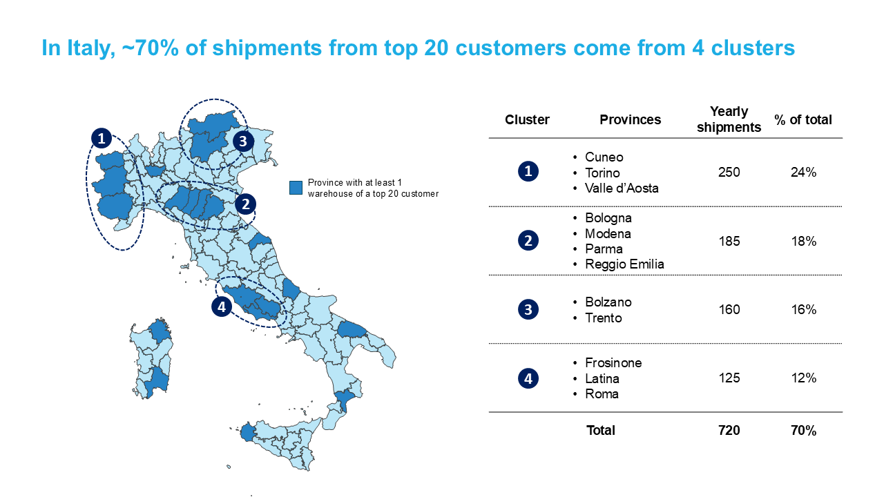
- Recolour one territory. Select it and pick a fill. That is how you show sales regions, risk levels or the markets you operate in, using your brand colours as exact values.
- Delete countries. Keep only what the slide needs. Select the neighbours you do not want and press Delete. The rest of the map does not move or degrade.
- Pull a region out to highlight it. Drag one region away from the map, enlarge it, and give it an outline or a shadow. This exploded call-out is a common way to spotlight one market, and it is impossible with a picture.
- Animate territories in sequence. Give each territory an entrance effect in PowerPoint's animation pane, and a market roll-out builds region by region as you speak.
- Hand the file to someone without the add-in. The shapes live in the .pptx file. Anyone can make every change above with plain PowerPoint, and maps you have already made stay editable even if you later stop using GeoAddIn.
Questions
Can people without GeoAddIn edit the maps I create? +
How is GeoAddIn different from downloadable PowerPoint map templates? +
Can I create sales territory maps with GeoAddIn? +
Does GeoAddIn need an internet connection? +
Does GeoAddIn work on Mac? +
14-day free trial · No credit card · PowerPoint for Windows